How to Optimize Images for WordPress in 2025 (Without Breaking Core Web Vitals)
Over the past few years, we’ve seen that achieving excellent website performance requires a three-pronged approach. We’ve optimized hosting speed and fine-tuned caching, but the third major issue has always persisted: images.
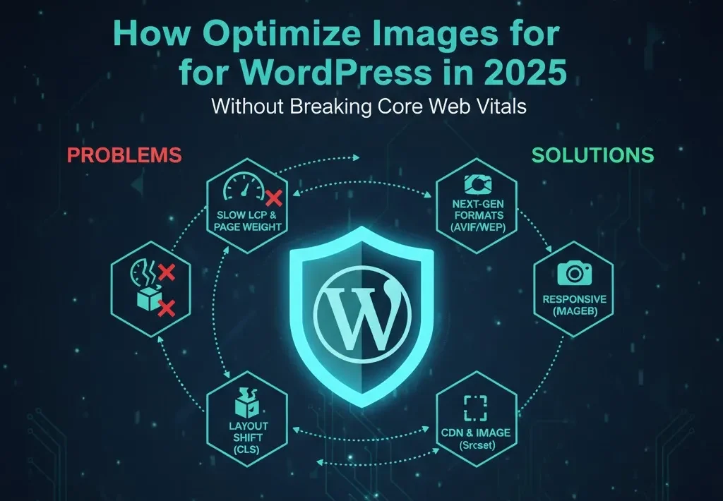
No matter how fast your hosting is, if your images are not optimized, they will significantly impact your site’s speed. Unoptimized images increase Largest Contentful Paint (LCP), cause Cumulative Layout Shift (CLS), and waste your bandwidth.
In this guide, we will provide you with a simple, practical, and plugin-friendly workflow that any WordPress user can follow to bring their site’s performance to the top of Core Web Vitals.
Why Images Matter So Much for Core Web Vitals
How images affect LCP and page weight
Hero images, large banners, and visuals appearing at the start of the content are often the page’s LCP element. If these images are large or uncompressed, the browser takes more time to load them, causing your LCP score to drop drastically.
On typical WordPress sites, images often account for 50% to 70% of the total page weight. If you cut that weight in half, you are essentially doubling your site’s load speed.
How bad images cause CLS and jank
Layout Shift (CLS) occurs when an image loads without a defined width and height. When the browser receives the image, it reserves the space, and the entire text and content below it get pushed down.
A simple example: Ad banners, sliders, and hero images loading above-the-fold; if they load late, they shift the entire page, resulting in a high CLS score.
Understanding Modern Image Formats (JPEG, PNG, WebP, AVIF)
When to use JPEG vs PNG
-
JPEG (Lossy): Use this for photos, gradients, and complex scenes. It is smaller but loses some data during compression (lossy).
-
PNG (Lossless): Use this for logos, icons, transparent backgrounds, and UI elements. It is generally larger but preserves quality (lossless).
Why WebP became the default in 2025
WebP offers better compression than both JPEG and PNG while maintaining similar visual quality. It is now supported by all major browsers, making it the default format.
Good rule: Always serve WebP as the default format, but ensure there is a fallback (JPEG/PNG) for legacy browsers.
AVIF and when it makes sense
AVIF provides even smaller file sizes than WebP, but requires more CPU power to encode and decode. Its support is still slowly rolling out.
Suggestion: Use AVIF only through plugins or CDNs that automatically understand and serve AVIF based on browser support.
Step Zero – Decide Your Image Strategy
Manual vs automated image workflow
You have two main approaches:
-
Manual: Optimize design files first $\rightarrow$ then reduce their size and upload them.
-
Automated: Upload large originals $\rightarrow$ then a plugin or CDN compresses them and converts them to WebP/AVIF.
Choosing your stack
There are two primary ways to handle WordPress image optimization:
Option A: Local Plugin (e.g., ShortPixel, Imagify, Smush, EWWW)
-
Pros: You get more control over compression settings; it often includes free tiers to get started.
-
Cons: Uses your hosting server’s CPU and memory; may increase your hosting bill due to resource usage.
Option B: CDN-based Optimization (e.g., Cloudflare Polish, Bunny Optimizer)
-
Pros: Optimization occurs at the edge (closer to the user), relieving your server; generally results in much better performance and global delivery.
-
Cons: Usually involves a monthly cost; provides slightly less granular control over file-by-file settings.
Preparing Images Before Upload (Design Side)
Sizing images correctly
Are you really uploading a 4000px wide image into your 1200px wide blog content area? This is a waste of bandwidth.
Simple Rules:
-
Hero Image (Full Width): 1600px–2000px max width.
-
In-Content (Blog Post): 800px–1200px max width.
-
Thumbnails/Avatars: 300px–600px max width.
Export settings from tools
When exporting from tools like Adobe Photoshop, Figma, or Canva:
-
Always export as JPEG or WebP.
-
Set the quality to 60% to 80%.
-
Strip (remove) metadata (like camera info).
Setting Up Image Optimization in WordPress (Plugin Example: ShortPixel)
We are using ShortPixel as an example because it provides a good balance:
Installing and connecting the plugin
-
Install the ShortPixel plugin.
-
Connect the API Key or your account.
-
Go to the Initial Settings Page to understand the credit system or billing plan (as these services are often credit-based).
Recommended compression settings
-
Compression Mode: Choose “Lossy” or “Smart” for normal blogs, and “Glossy” or “High quality” for photographers/portfolios.
-
WebP: Definitely turn on automatic WebP generation and the “serve WebP to supported browsers” option.
-
Originals Backup: Keep Backups of originals turned on (so you can restore if the compression quality looks poor).
Bulk optimizing the existing media library.
After installing the plugin, run the Bulk Optimizer. It will begin optimizing files across your entire library. Monitor the file count and savings percentage.
Enabling Lazy Loading and Responsive Images
Native lazy loading and plugin options
In addition, modern browsers now support the loading="lazy" attribute, and WordPress automatically adds it to images that are below the fold.
-
Recommendation: Use the plugin’s lazy-load features (which work for both images and iframes). However, you must always exclude the LCP Hero Image from lazy loading, or it will delay the load!
Responsive images with srcset and sizes
The concept of srcset and sizes Is that the browser chooses the best size from the srcset list based on the user’s device width.
-
Note: WordPress automatically generates multiple sizes for every uploaded image. You just need to ensure your themes and page builders are using these correct sizes (like
medium,large), and not always thefullsize.
Fixing CLS from Images, Carousels, and Ads
Always reserve space for media
However, the best way to stop layout shift (CLS) is:
-
Add explicit
widthandheightattributes oraspect-ratioCSS to hero images, banners, and thumbnails. -
This ensures the browser knows how much space to allocate before the file loads, and the layout jump does not happen.
Dealing with sliders, carousels, and ad slots
-
Sliders: Limit heavy sliders and carousels above-the-fold. Use one static hero image whenever possible.
-
Ads: Reserve fixed containers (CSS
min-heightoraspect-ratio) for ad slots so that when ad scripts load late, they do not push content down.
Offloading Images to a CDN or Object Storage (Optional Advanced)
Using a CDN image optimizer
For example, services like Cloudflare Images, Bunny Optimizer, or similar services handle resizing, WebP conversion, and caching at the edge. Set up
-
up flow: Connect your domain $\rightarrow$ turn on optimization $\rightarrow$ update your image URLs through the plugin.
Media offload for big libraries
If your media library is very large, moving it to Amazon S3 or similar Object Storage can be better for both performance and cost.
-
Risks: Plugin lock-in and potential considerations for future restoration.
Testing Your Image Optimization
Lab tools
After optimization, use these tools to verify your results:
-
Use PageSpeed Insights, WebPageTest, or GTmetrix.
-
Check: which is the LCP element, how much the total image bytes have decreased, and whether the “serve images in next-gen formats” warnings have disappeared.
Real-user checks
Load pages on a 3G/4G mobile network. Scroll fast and check for:
-
Are there blurry images showing?
-
Are there late loads?
-
Are there any layout jumps (CLS)?
Image Optimization Checklist Before Publishing Any Post
Before publishing any post, check the following:
-
All images resized to sensible max width (no huge originals).
-
Compressed (WebP/optimized JPEG/PNG) via plugin or export.
-
Lazy loading is enabled for below-the-fold content.
-
Hero and above-the-fold images have fixed dimensions; no CLS.
-
Post passes PageSpeed “serve images in next-gen formats” and “properly sized images” audits on mobile.
Call to Action
Now is the time to put this knowledge into action. Pick your site’s heaviest page, follow this guide, and run a before/after PageSpeed test. You will see a significant difference in total image bytes and LCP!
Ready for the full performance roadmap? Read our articles on Core Web Vitals and caching [Caching Articles Title], and subscribe to learn about future content on security and AI-assisted workflows.

One Comment on “How to Optimize Images for WordPress in 2025 (Boost Core Web Vitals & Speed)”